Showing posts with label Market Indicators. Show all posts

Monday, March 8, 2021

Newbie Portfolio - End 2021 02

 Nothing much to say for this boring month. Just Shell having some upward momentum.


Net Asset Value is slightly higher compared to last month due to slight movements in Asset Prices, particularly Shell Equity.


As mentioned in last month's blog post, Allianz 5.5% Perpetual Bond has been called and it will disappear from my portfolio at the end of March 2021 (along with a reduction of Investment Loans). The Portfolio Margin Ratio will come down to a comfortable level.


Regards, Newbie

This blogpost is provided to you for general information only and does not constitute a recommendation, an offer or solicitation to buy or sell the investment product mentioned. It does not have any regard to your specific investment objectives, financial situation or any of your particular needs. Accordingly, no warranty whatsoever is given and no liability whatsoever is accepted for any loss arising whether directly or indirectly as a result of your acting based on this information.


Saturday, December 6, 2008

S&P weekly chart - 6 Dec 08

Despite posting the biggest number of jobs decline in nearly 34 years and the declaration of recession in the US earlier in the week, S&P managed to hold strong around the 800 region. In fact S&P closed higher on the last day of trading even after negative jobs report.

If you see the long term historical chart, S&P around 800 is also the level of support after the dotcom bubble in year 2000. The next important psychological support level should be around 250 after the 1987 crash which is a level that we don’t wish to see.

S&P weekly chart - 6 Dec 08

Let us look at the latest S&P weekly chart. RSI(14) is at oversold level and the indicator is showing positive divergence which signals a reversal soon. MACD histogram is also signaling a weakening downtrend and positive slope is forming which suggests a reversal. Again MACD line is at complete oversold level. It is about to turn and cut the MACD signal line from the bottom. You may wait for the cut to happen as confirmation of a reversal.

In my opinion it seems market has factored in all the negative and recessionary news. It is time to look forward to the economic recovery process and do some bargain hunting if you have not done so previously.

Sunday, September 21, 2008

US market review - 19 Sep

The US market ended historically with S&P index gaining about 121 points on the last two days of the week. That was almost a 10% rise in just two days. The rally was boosted by the government bailout of AIG and a plan for the biggest revamp of US financial market as announced by President Bush himself.

I believe it will take some time for the turmoil in financial market to cool down as liquidity is still of a concern. It is evident from the TED spread chart which is currently at a level of 3. This level was last reached in the year 1987. You may take a look at what TED spread is all about from the link I provided.

Another concern you need to take note is the trailing twelve months S&P PE ratio. It is currently at a ratio of 24.7 which is on the high side I would say. I remember S&P ratio was about 18 in late 2007 and despite of S&P index crashing more than 300 points from peak to trough, the PE ratio is still higher now. That means earnings have dropped tremendously. Some experts commented that the high ratio is meaningless as a major portion of reduced earnings is contributed from stocks in banking sector. You may visit the link if you wish to check PE ratio of various markets.

Let us see the latest S&P daily chart. There are positive trends that you can deduce from the chart. First of all, trading volume had been flat since March but lately there is an evidence of increased volume with a big rise in S&P index. There is also a positive divergence forming on the MACD line. It looks like soon the index is going to test the 200 days moving average for the second time which was held as resistance in late May.

S&P daily chart - 19 Sep

Also with the ban of naked short selling of stocks in US market, it means downward or selling pressure is greatly reduced. I think that is a good move to curb speculators who have been taking advantage of the down trend and abusing the power of shorting without paying financing charges to borrow shares.

In my opinion even though the financial market turmoil is not over yet, now is a good opportunity for long term investors to do some bargain hunting if they have not done so previously. If not, they may miss the ride. As usual, personally I have already picked up some stocks before the rebound and in the beginning of the month.

Friday, May 16, 2008

Volatility Index (VIX)

The Chicago Board Options Exchange Volatility Index (VIX), is a benchmark for options prices in the US. The VIX gauges the cost of insuring against declines in the S&P 500 index. That means it gives a level of bullishness from investors in the US.

If the index is high, investors are foreseeing that S&P index to fall or collapse. Thus investors in US buy options (or like put warrants in Singapore market) to hedge their investment against any correction. If the index is at low level it means that investors are bullish with the market, so there isn't any need to hedge or protect their investment.

The chart below shows the historical trend of VIX since year 1990. You can see that the chart is inversely correlated to the S&P index. During the major crash in year 2000, VIX is at all time high level and during the recent strong bull run from year 2003, VIX is approaching low levels.


Historical VIX chart


If you were to zoom in to the latest VIX chart, you can see currently the index is reaching low level like in Oct 2007. There is negative divergence forming on MACD histogram. That means the VIX is trending downwards. If the VIX can break the support level of 17.5, we can expect it to test price of 15 which is the 200 days moving average. Again cautious investors can always wait till the index reaches a value of 10 to ensure certainty.

Latest weekly VIX chart

Thursday, May 15, 2008

TED spread

Another useful indicator which I learn recently is the TED spread. It is the difference between three month US T-bill interest rate and three month London Inter Bank Offered Rate (LIBOR). The T-bill is considered as risk free while LIBOR represents the credit ratings of corporate borrowers.

In a short explanation, the TED spread is a measure of liquidity and shows the willingness to which banks lend money with each other. A widening difference signals a credit crisis or tight money in the financial market as banks are not willing to lend out money due to higher default risk.

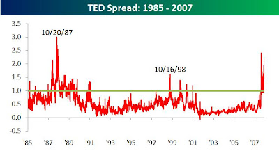
The chart below shows the TED spread over the last twenty years. It is interesting to note that the peaks of the spread are exactly on the day after the previous major crashes in 1987 and 1998. Investors should not rely on the spread as an indicator to crashes but instead should focus on the direction of the spread which signals a recovery in the financial market. From the chart, as soon after the TED spread peaked, S&P index rose with satisfactory returns. The latest peak shows when the sub prime crisis started.

Historical chart of TED spread

Chart courtesy of Bespoke

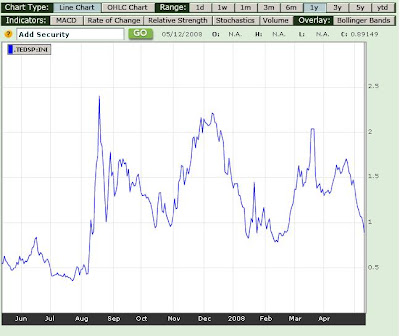
Attached is the latest one year chart of TED spread from Bloomberg. If you see the current spread from the chart, it is near low level and indicates that the worst of the credit crisis that prompted banks to restrict lending may be over. If you want to be certain, probably you can wait till it reaches a difference value of 0.5.

1 year TED spread

Friday, May 9, 2008

Facts show no recession

I just came across an article from yahoo news and I find it an interesting read. It gives me an added optimism about the market. According to the author, there is no evidence showing that US is in a bear market or a recession. A bear market is defined as a 20% drop in the major stock market and a recession is defined as two consecutive quarters of negative GDP growth.

According to the facts and truths he presented, US is not in a bear market or recession.
  1. From its closing peak at 14,164.53 last October the Dow fell 17% to its closing low on March 10th. The S&P 500 slid 18.4% from its October high to its March low. The broadest measure of the U.S. market, the Dow Jones Wilshire 5000 showed a 19% high-to-low decline.
  2. Despite the subprime mortgage crisis and a wave of home foreclosures, gross domestic product (GDP) growth was still in positive territory in the first quarter, albeit an anemic 0.6%.
  3. The Conference Board's index of Leading Economic Indicators, turned positive in March, after five consecutive negative months.
  4. Weekly jobless claims are considered a good reference point for the health of the economy. If they top 400,000 for a while, some economists say it indicates a recession. In fact weekly jobless claims remained comfortably below 400,000 and fell to 365,000 in the previous week. In contrast to 2001 recession, jobless claims moved above that level and stayed above that level for two years.
  5. Unemployment rate dropped to 5% in April. It averaged nearly 10% in 1982 and 1983, roughly 7% in 1991-1993 and 6% in 2002-2003 during real recessions.

You can read further Howard R. Gold article on What Bear Market? What recession? from the link.

Saturday, April 19, 2008

Bullish recovery from US

S&P weekly chart ending 18 April

To continue the article I posted before here, let us see the weekly chart of S&P 500 large cap index which had just ended. The index closed at 4.31% higher than previous week. As you can see, there is a bullish crossover of MACD line over its signal line and accompanied by higher volume prior to the previous week. The next resistance level I expect is at the 50 weeks moving average. If you look at the 3 year chart of S&P 500 large cap index, you can see that this line has been a good support and resistance lines.

On the fundamental front, Google posted good first-quarter earnings and revenue growth that exceeded analysts' predictions. During the week also, Intel Corp and Coca Cola reported better than expected results. Even though Citigroup posted a loss of $5.1 billion due to bad debts on mortgages loan, that result has brought something for the market to cheer about as it managed to trim losses down from $10 billion recorded in the previous quarter. That is in fact a good sign that the credit crises is winding down.

Thursday, April 17, 2008

Important economic data

With fears of US recession looming around the world, it is good to follow and keep track the release of important data from there which can affect global market movements as a whole. I have compiled a list of important indicators that you should pay attention very closely.

If you want an exact date of each release, you can refer to Bloomberg economic calendar. As there are too many type of releases available, I suggest you stick to the recommended releases below and find out the exact date.

Type of releaseApproximate reporting dateFrequency of releaseSource
FOMC Meeting1st Tuesday of the monthEvery 6 weeksFederal Reserve
Unemployment Rate1st Friday of the monthMonthlyBureau of Labor Statistics
Consumer Sentiment Index2nd Wednesday of the monthMonthlyUniversity of Michigan
Retail Sales2nd Thursday of the monthMonthlyBureau of the Census
Producer Price Index2nd Friday of the monthMonthlyBureau of Labor Statistics
Consumer Price Index3rd Monday of the monthMonthlyBureau of Labor Statistics
Balance of Trade3rd Wednesday of the monthMonthlyBureau of Economic Analysis
Manufacturers' Orders3rd Thursday of the monthMonthlyBureau of the Census
New Home Sales4th Monday of the monthMonthlyBureau of the Census
Consumer Confidence Index4th Tuesday of the monthMonthlyThe Conference Board
Gross Domestic Product4th Thursday of the monthQuarterly of yearBureau of Economic Analysis

Sunday, April 6, 2008

Anticipating a rebound in US


As we know most of the markets in the other region take cue strongly from the US market, therefore it is worthwhile to take a look at the US chart. I have attached a weekly chart of S&P 500 large cap index ending this week.

On a positive note, you can see there is a positive divergence developing on the MACD histogram. Also its MACD line is about to cut signal line from the bottom which indicates a bullish sign. However there is just a slight increase in volume for this week prior to previous week to really justify a reversal.

Even though I still expect volatility to stay in the mid term, I am anticipating a reversal in the short to mid term. You might want to monitor the volume in US for the up-coming week or wait for confirmation from the MACD line crossover before triggering a purchase.

In order to minimise risk of buying at a high, you can stagger your purchases at different period. Nevertheless if you are a long term investor, this is a good chance to do some bargain hunting if you have not done so previously.

Sunday, March 9, 2008

Yield curve

While I was at the airport in the morning I went holiday, I visited a book store and came across a book titled The secrets of economics indicators by Bernard Baumohi. This book explains the meaning of all important and key indicators like consumer price index, producer price index, consumer confidence, new home sales, etc for the world’s biggest economy of the world. Understanding these indicators can be essential on how they can affect the market sentiment.

Results from the indicators have a variable range of impact on the stock market. As I was browsing, a topic on US yield curve caught my attention. According to the book, the yield curve has a very significant impact on the stock market. Furthermore it has accurately predicted all the previous recessions except for the year 2000 recession.

The topic on yield curve thus triggers me to know more about it. Basically the curve is a yield plot of US treasury bills across various maturities period at a point of time. The shape of the curve can dictate the state of economy as a whole.

During good economic growth, the curve is an upward sloping. It makes sense that the yield increases as the maturity becomes longer since most investors are putting money in equities or stocks when market is good. However when times are uncertain or economic outlook turns gloomy, many investors are putting their money in safe havens like treasury bills. As quoted from stockcharts website, an inverted yield curve is a sign of tight money and bearish for stocks.

You can monitor the shape of the yield curve at any point of time here. So based on this indicator, are we seeing a recession coming? It certainly doesn’t look so isn’t it?